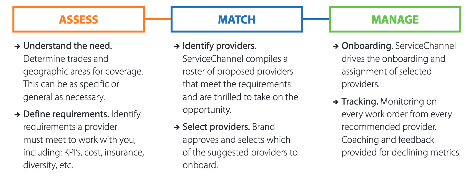
Provider Match Sales Dashboard
This dashboard was created so that sales representatives from Service Channel could provide examples of what their SaaS product can do for their potential clients. I tried to put myself in the mind of the salespeople, what tools and data would I need to provide to entice a customer, saving them time and money.

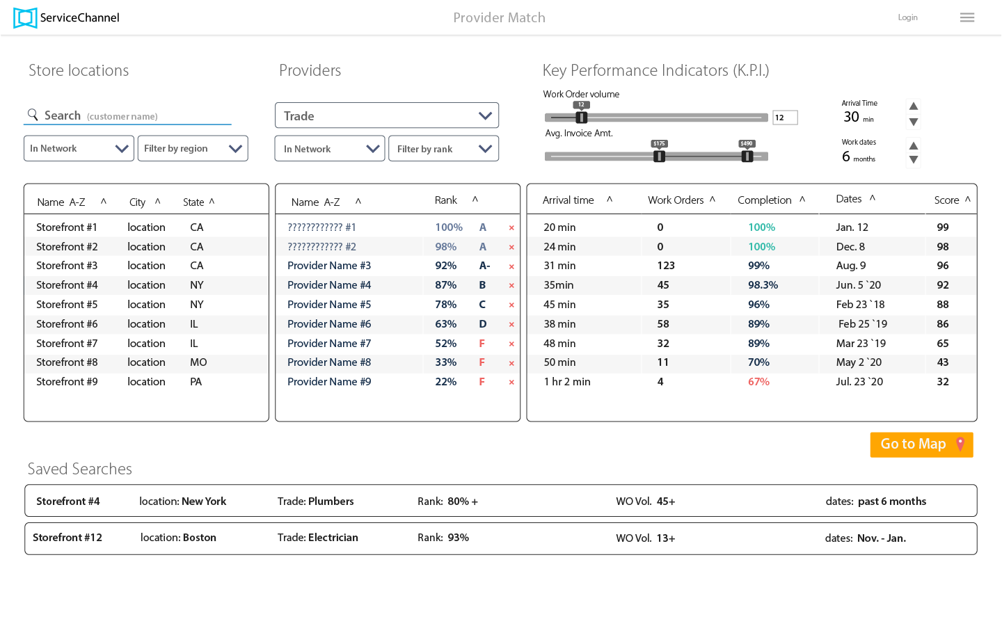
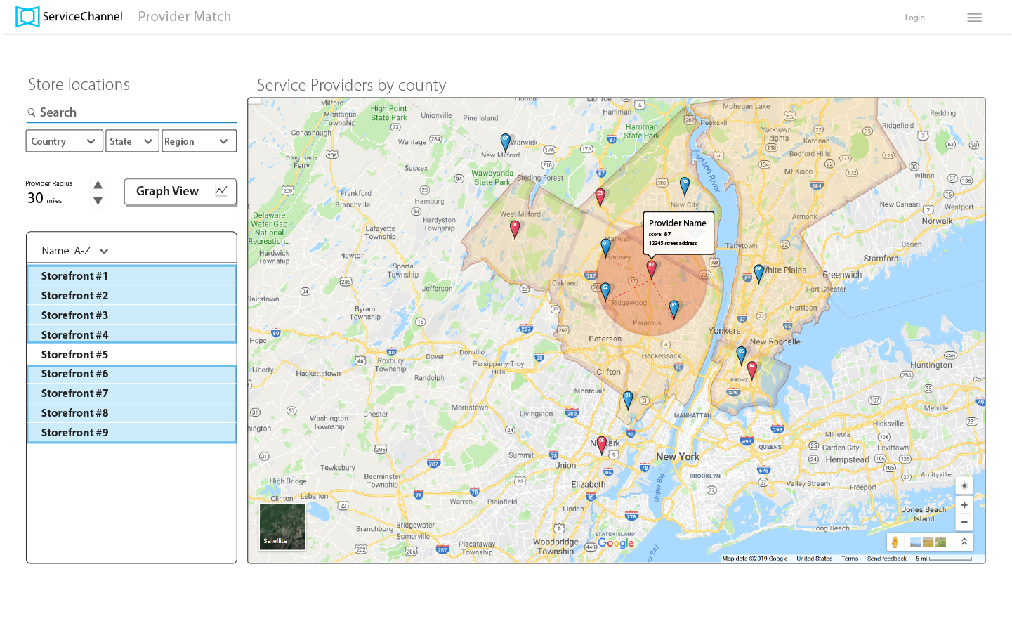
Below: Initial screen for super-users to filter service providers according to store locations (dark mode didn't make the cut)
We did some white-boarding sessions as we discussed the project scope. (not pictured)
We did some white-boarding sessions as we discussed the project scope. (not pictured)

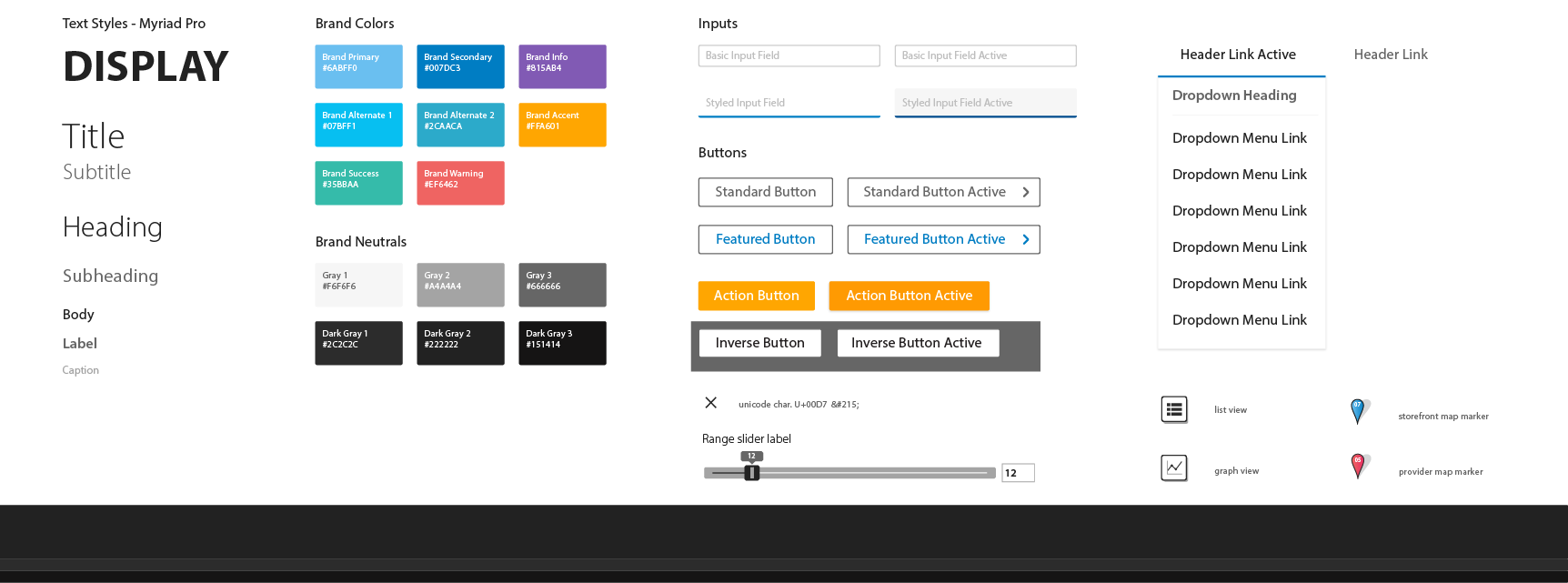
Style guide - a living system of design elements shared with the design team and developers
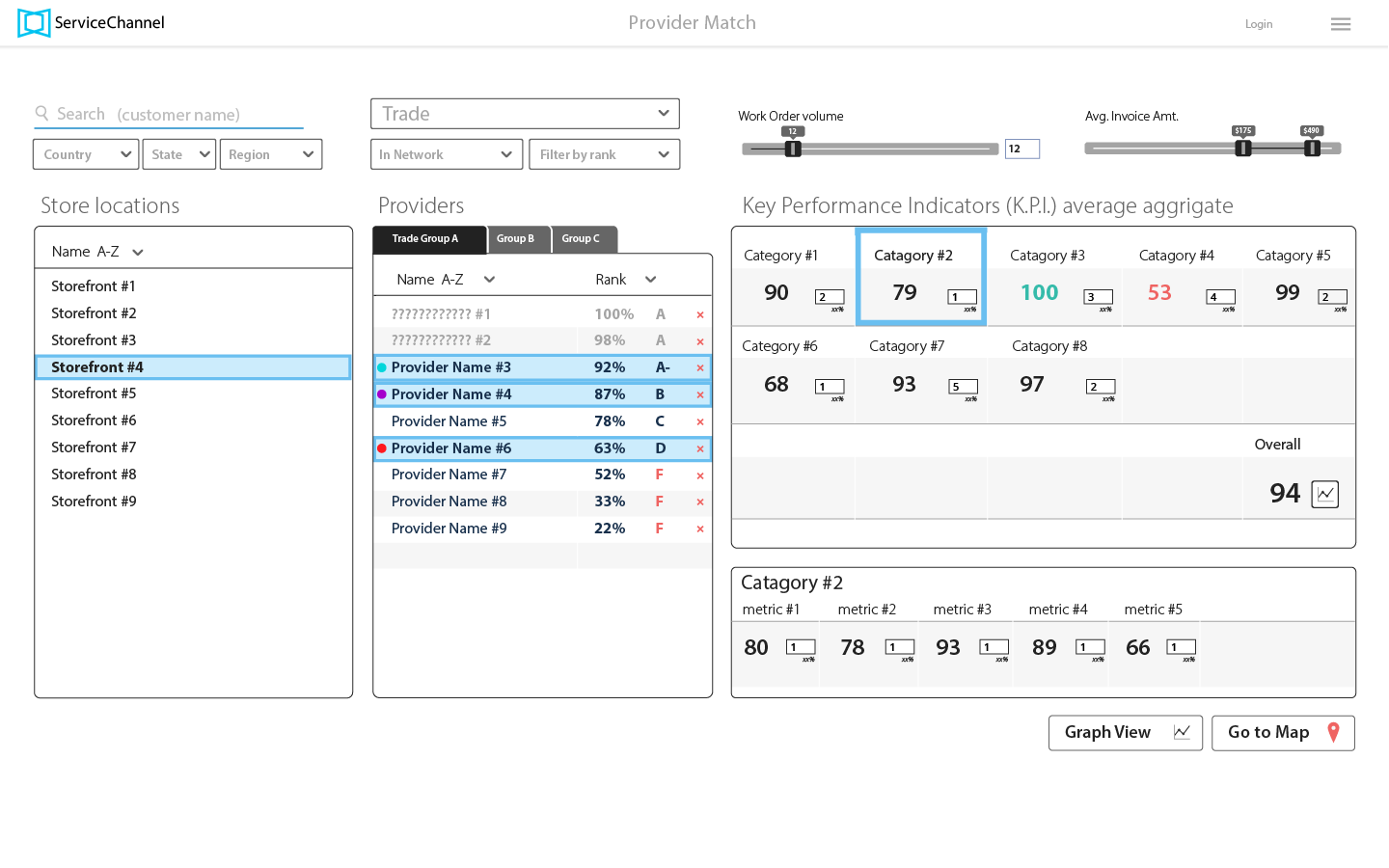
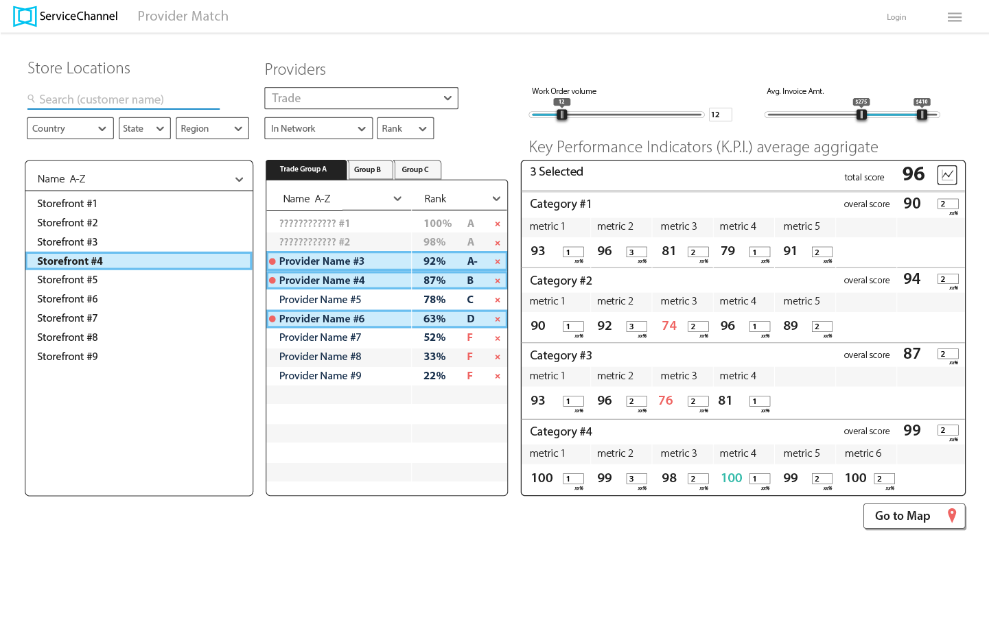
Key Performance indicators (KPIs) - these designs are about exploring the possibility of weighted metrics
Maps (two options) - maps show the location and distance between of the service provider and the storefront. Select multiple storefronts and providers to find the best match.

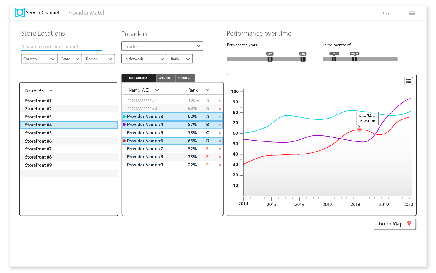
Graph View - if you are noticing the ???? that is a hidden name for a service provider for our client Service Channel to sell their top contractors.
Final Thoughts
As the design process continued we discussed the interface deeper and obtained stakeholder feedback, this led us to make direct changes and find solutions to this complicated product. Yes, you do see minor changes across those mock-ups, this was a work in progress as I left the project behind. The design phase would ultimately take months to complete, in that time frame the in-house designer came back and took over the project. My contribution led to a better design by being a well thought out first attempt.
Next Project