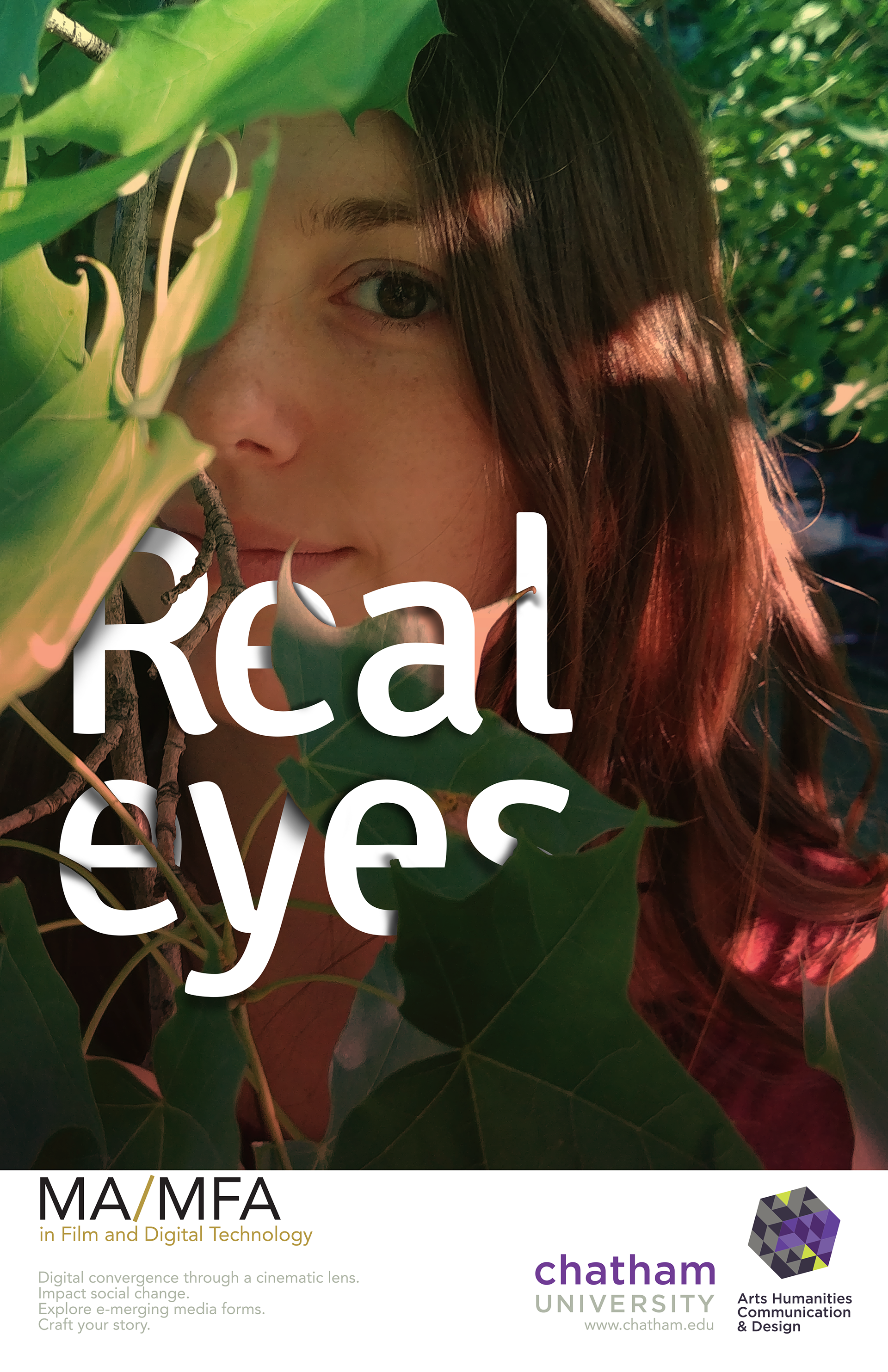
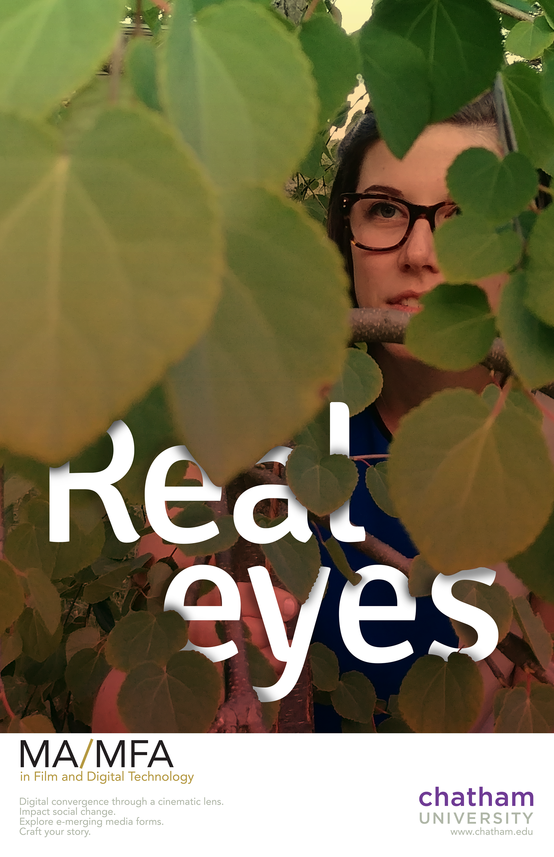
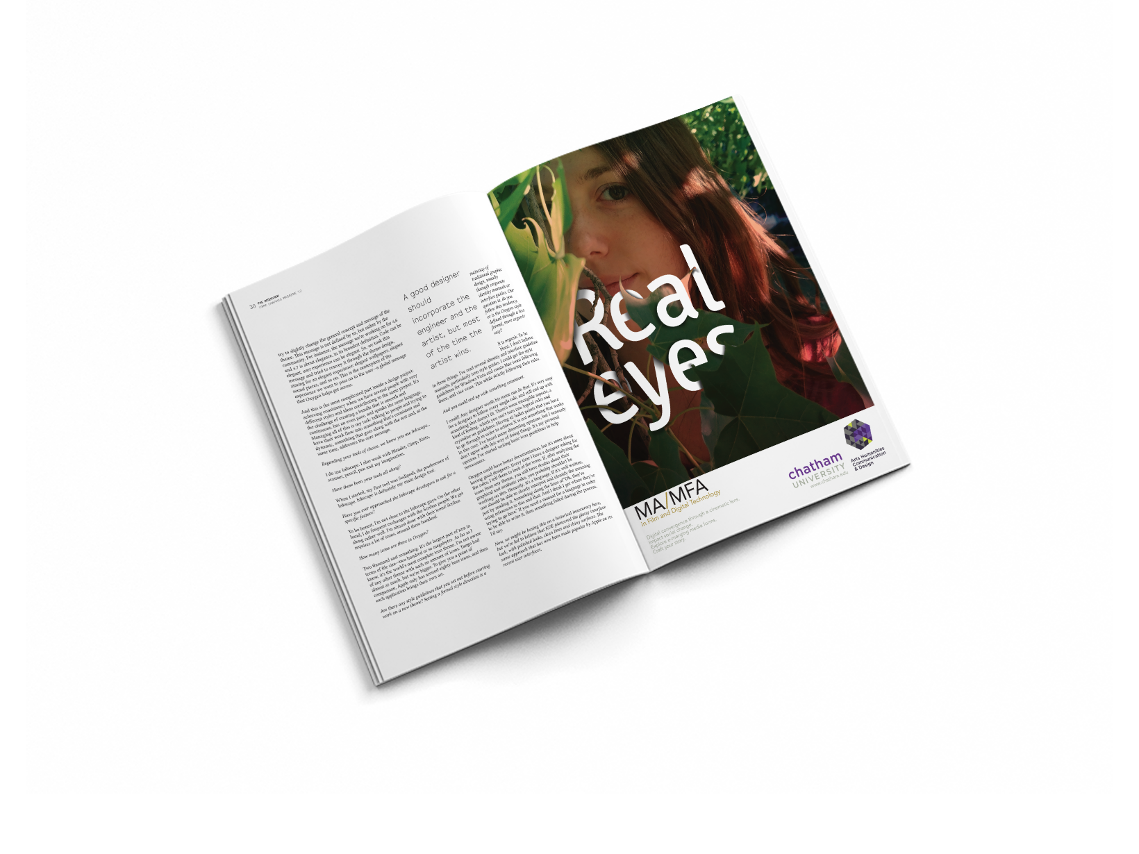
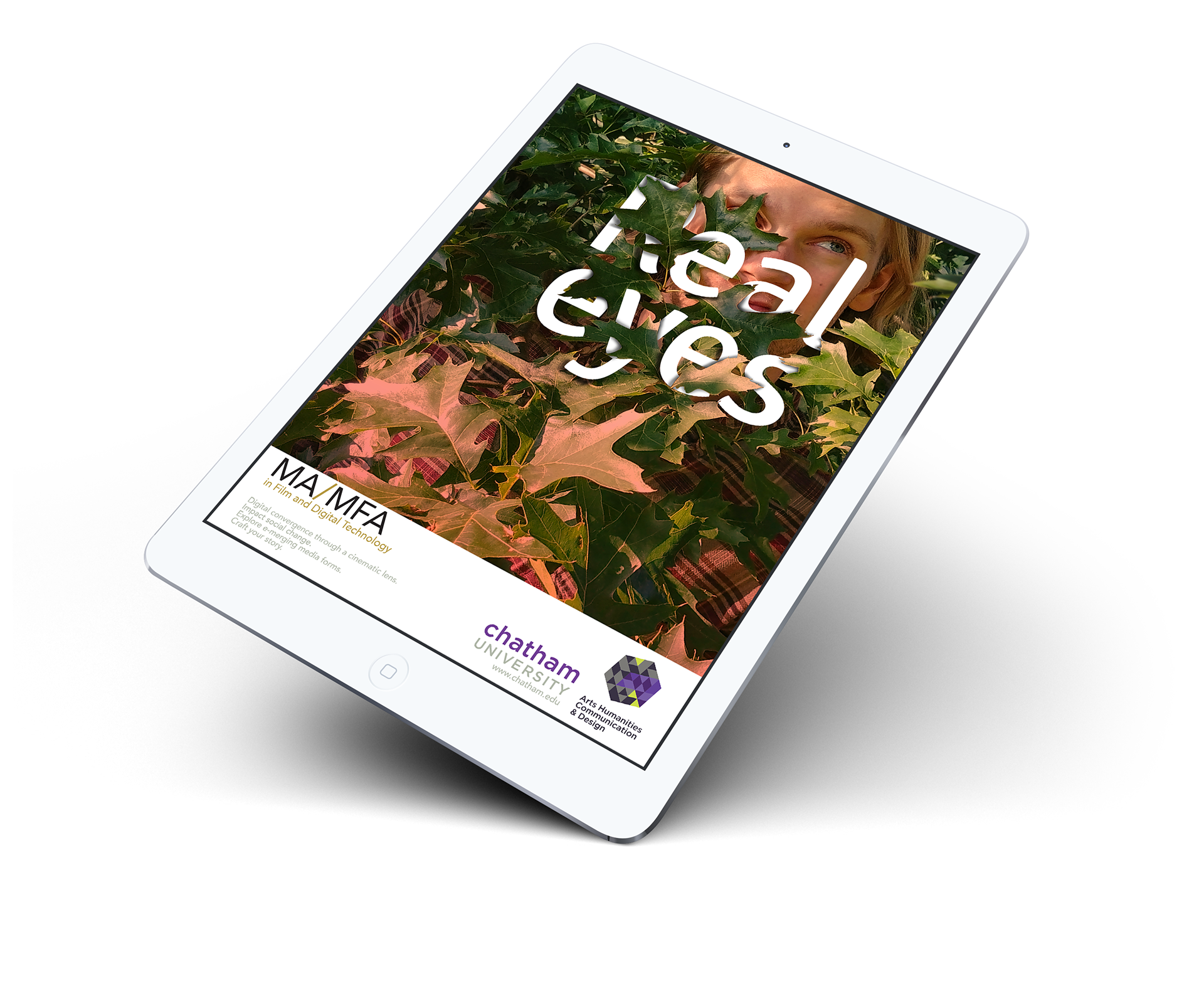
Chatham University graduate degree programs in Film and Digital Technology and Interdisciplinary Design prepare students for jobs in the visual arts. The Real Eyes campaign is about seeing the world in a new way and real-izing your dreams and aspirations.
_________________________________________________ __________________________________________________
My Role: UX Researcher/Visual Designer
Teammates: Brianna Rice and Rachel Keeney
Teammates: Brianna Rice and Rachel Keeney
The goal of this design is to bring a feeling of depth while encouraging exploration in the minds of its viewers. The playful type treatment delivers a mysterious message with multiple meanings. The "real eyes" are very literal in one sense and they see the world in very different ways, hinting at the way that the viewer a knowledge seeker may "realize" hidden truths. Now that a new perspective is gained the student wants to share their view of the world empowered by their education.
Logo Exploration
As part of my fellowship in the art department of Chatham University Pittsburgh I was asked to brand the college of Arts, Humanities, Communication, and Design. This challenge had me analyzing the connections between the four disciplines.
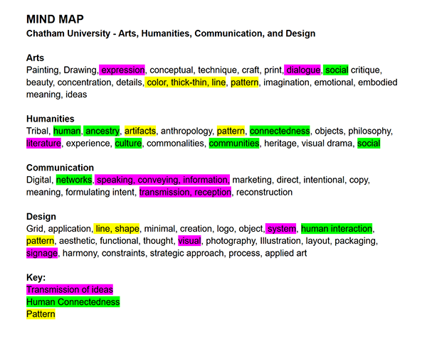
Mind Map
This mind map identifies words that correlate with each of the departments then was color coded to identify similar phrases or ideas that tie the schools together. Drawing from those connections a general idea of how the logo and brand was formulated, leading to more research in the form of a mood-board.
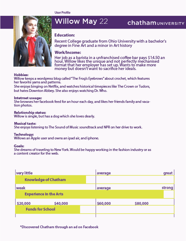
User Profiles + Competitor Analysis
To understand perspective students user personas were created after a brief round of interviews with current and future students. Focusing on the knowledge students had of the Arts program before attending Chatham and uncovering their goals for their education and future employment gave me a sense of the type of design that would resonate with them.


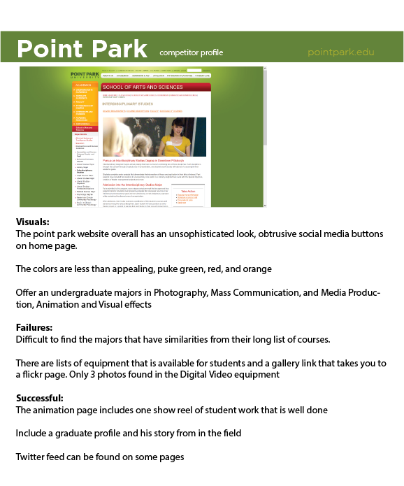
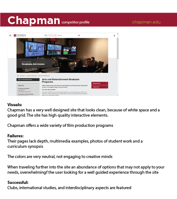
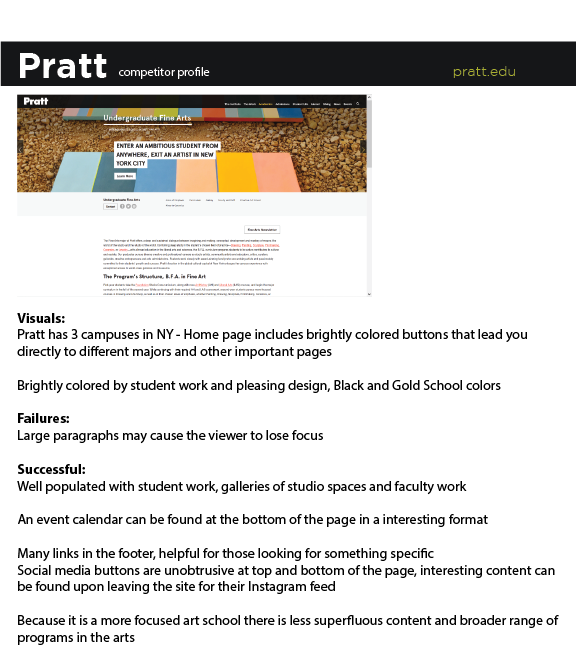
There are competitive schools across the country vying for the enrollment of students in the arts. Each one has its own pros and cons. From conducting a competitor analysis I found that successful websites had one thing in common they presented student work prominently and interactively. The sites failed by having an overabundance of options that were not filterable.
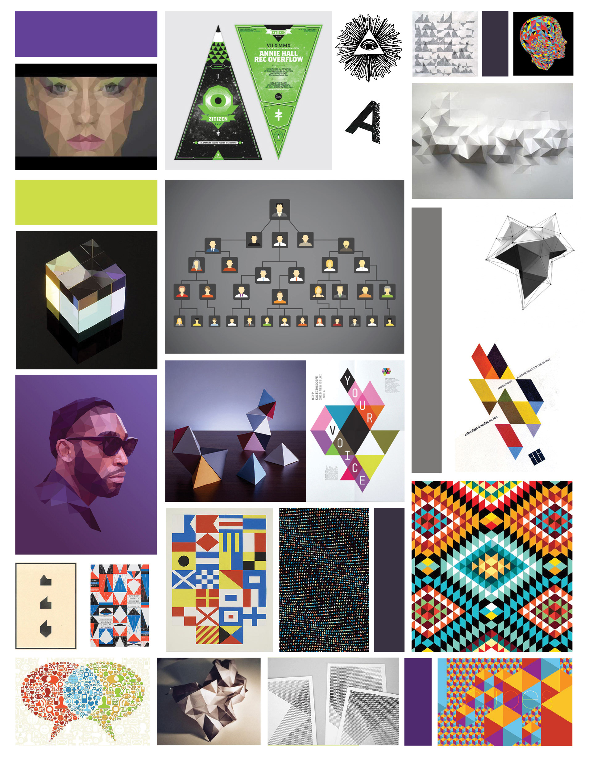
Iterations + Mood Board
A prominent design element in the Chatham style guide is the triangle, I wanted to explore the possibilities of designing with only a triangle because I knew the simple shape could be reconfigured to create many different forms. The final logo subtly incorporates the form of the letter C , an open box, the patchwork feeling of a quilt and Chatham brand colors.

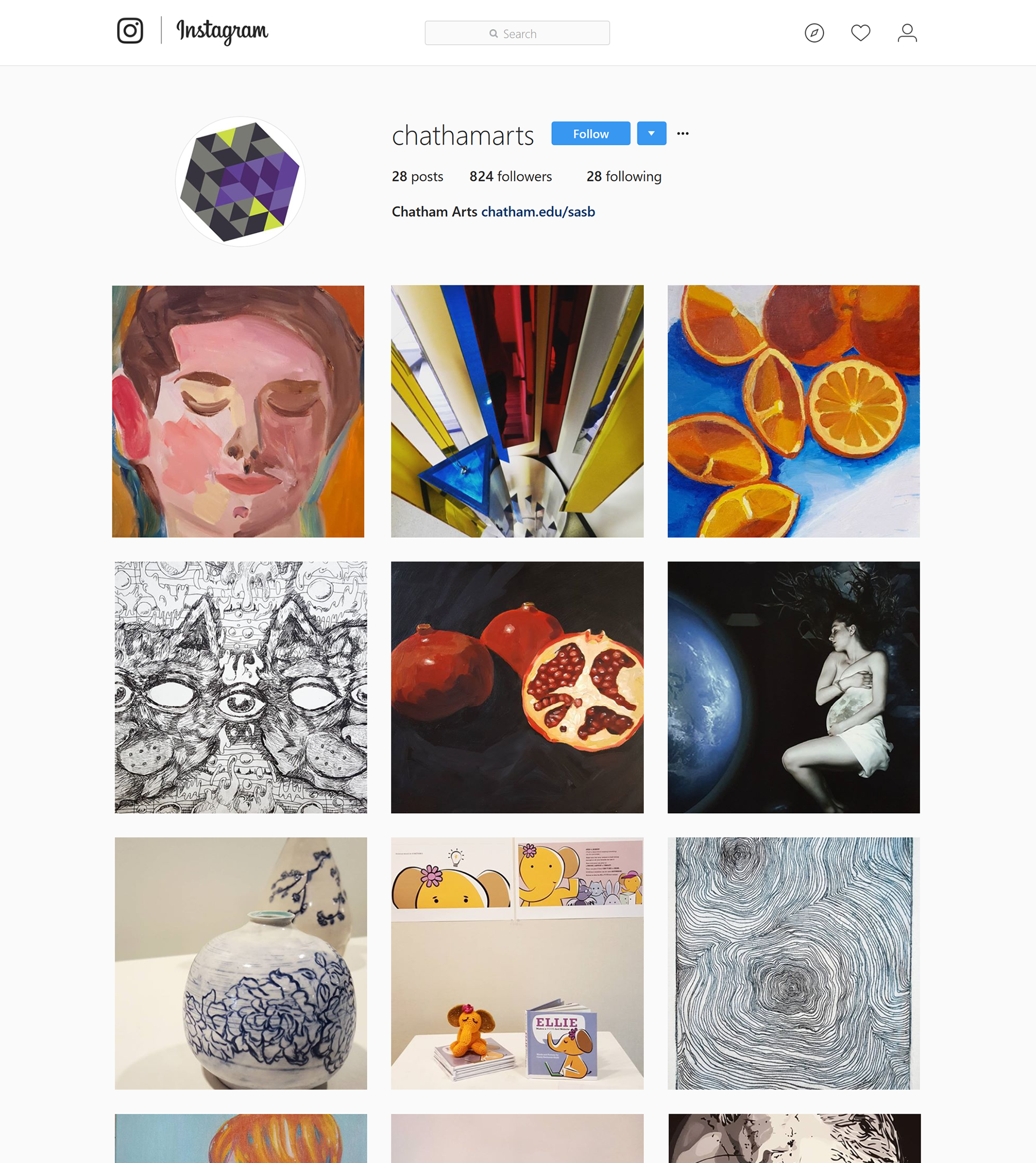
An example of the logo in action - along with an Instagram page for the arts department that I created and curated.
Final Thoughts:
As a whole my time working in the Chatham Arts department gave me a better understanding of institutional requirements for bringing a project to life. Employees of the university have to meet objectives set forth by committee and follow strict branding guidelines. I was able to find a few niche projects that passed the test, my work was met with positive and constructive feedback. I was able to share my assets with incoming designers to keep the initiative alive.
Next Project